Started in the founder’s own family home after observing his mother’s difficulty finding food ingredients for treasured dishes from her home country, Cuisala became an e-commerce platform where consumers of all types of cuisine could connect to small country-affiliated mom and pop shops in America— shops that weren’t necessarily in the position to establish their own on-line presence.
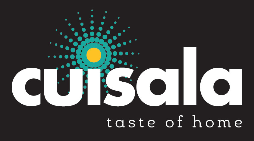
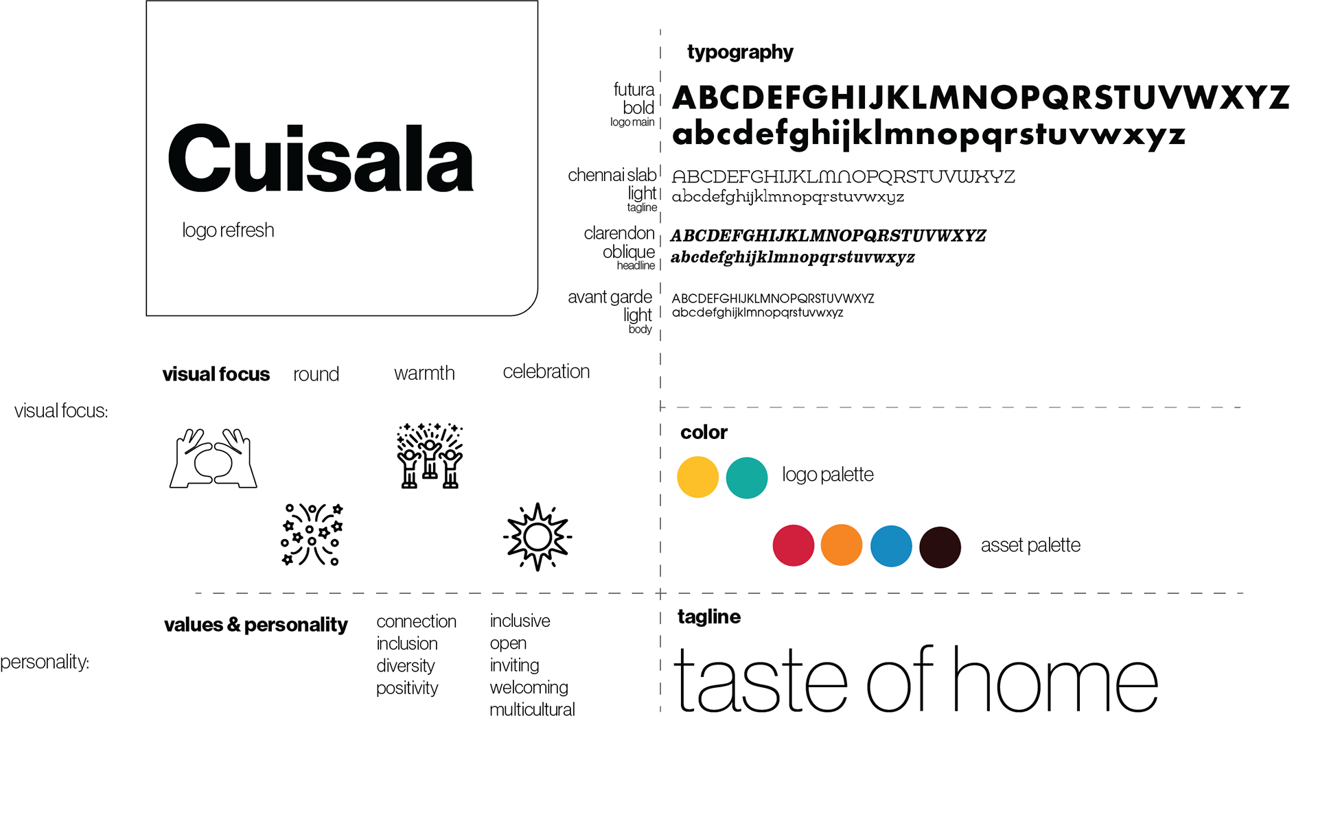
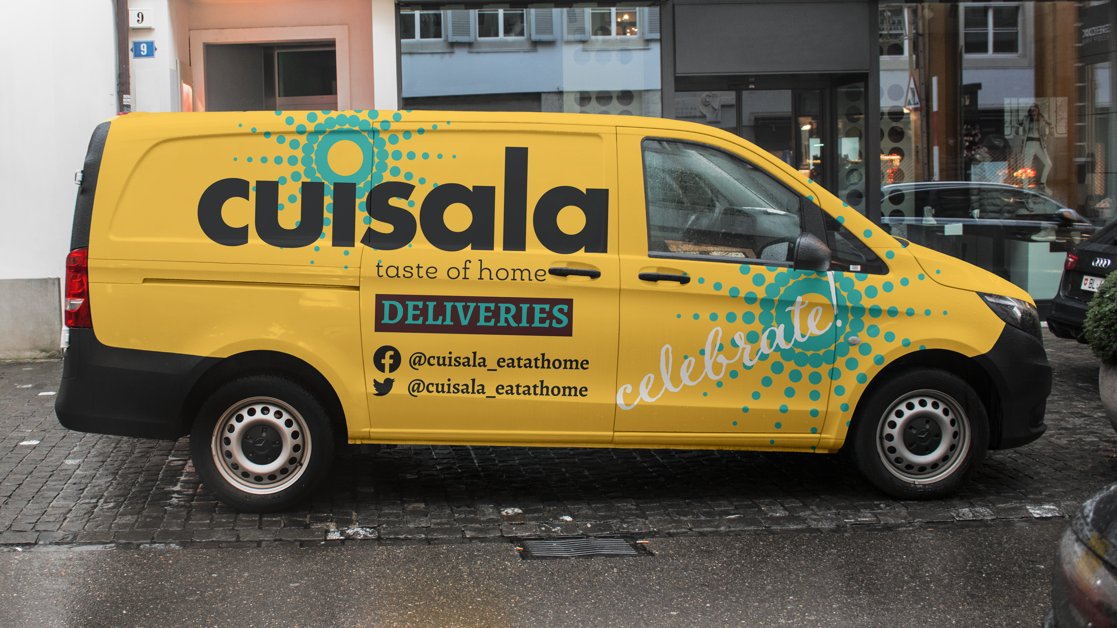
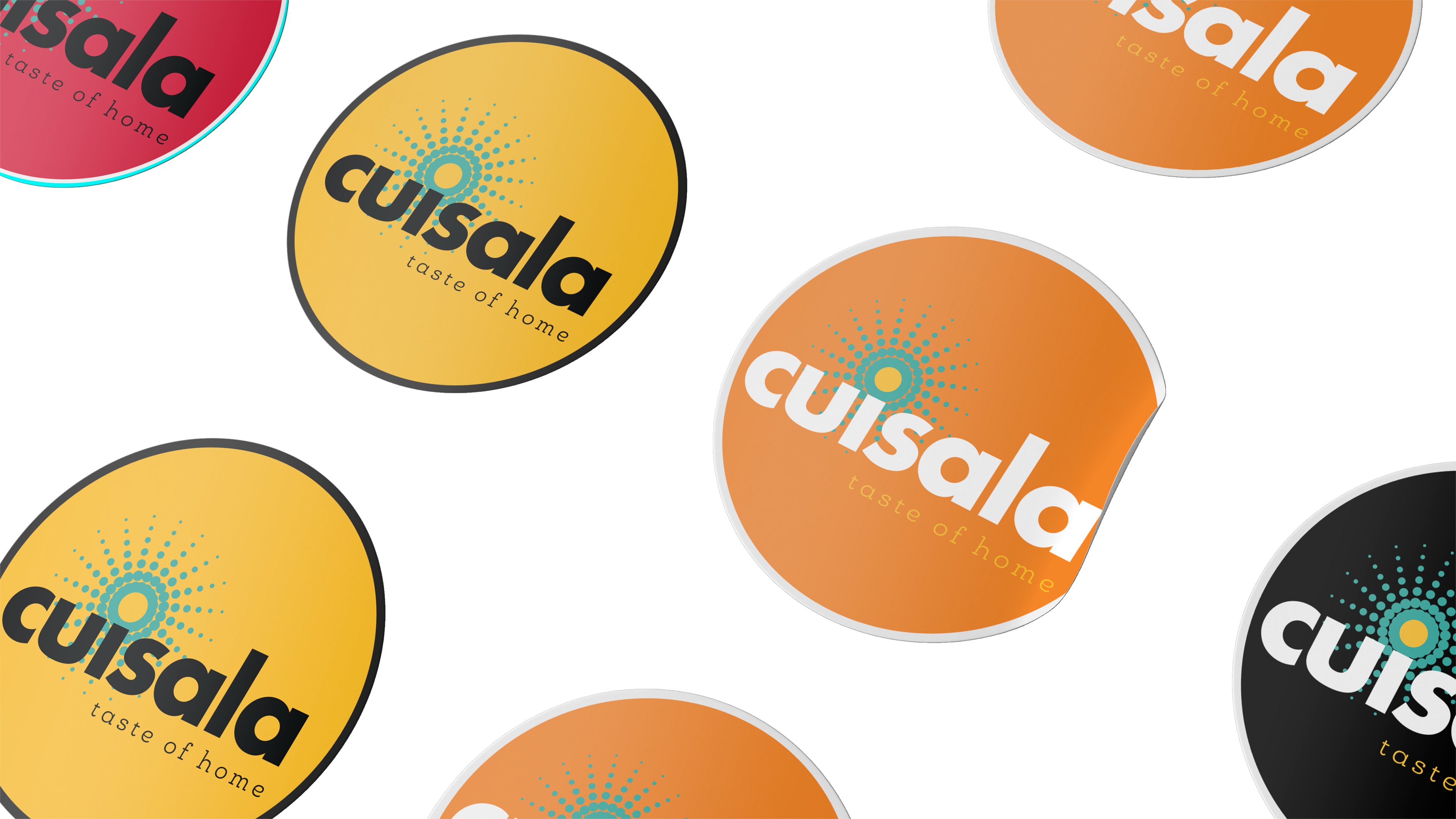
The final design uses a sunburst pattern to represent the theme of celebration.
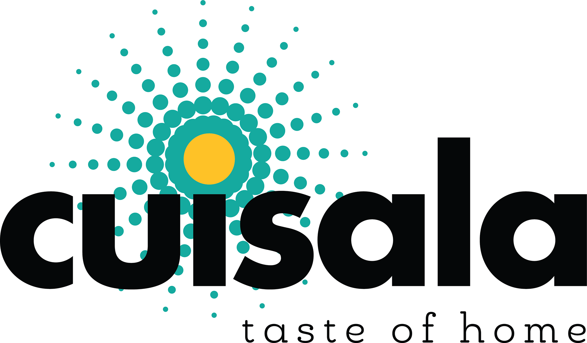
I offered 3 themes at the beginning of my process, "Something New", "Connection", and "Celebration", which was ultimately chosen to represent Cuisala's new logo.

The final logo design included a color palette that coordinated with the existing palette and a tagline to help define the brand at first glance.
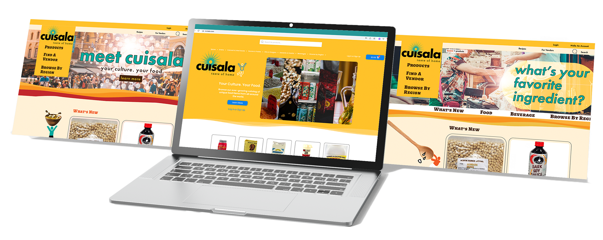
The new logo was used on the website. (Website design by Alex Simeon.)
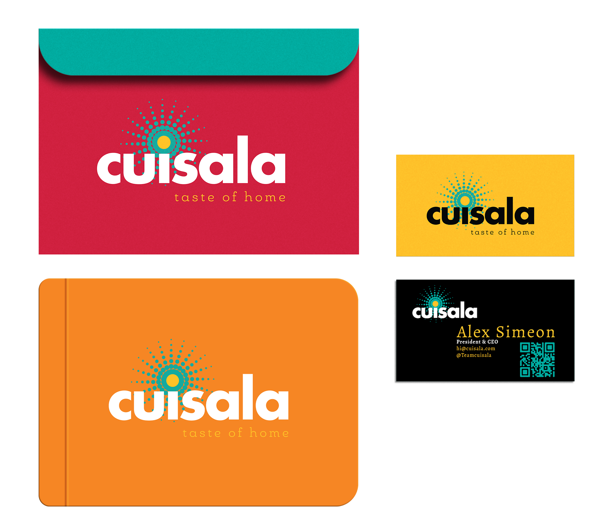
And, on stationary:
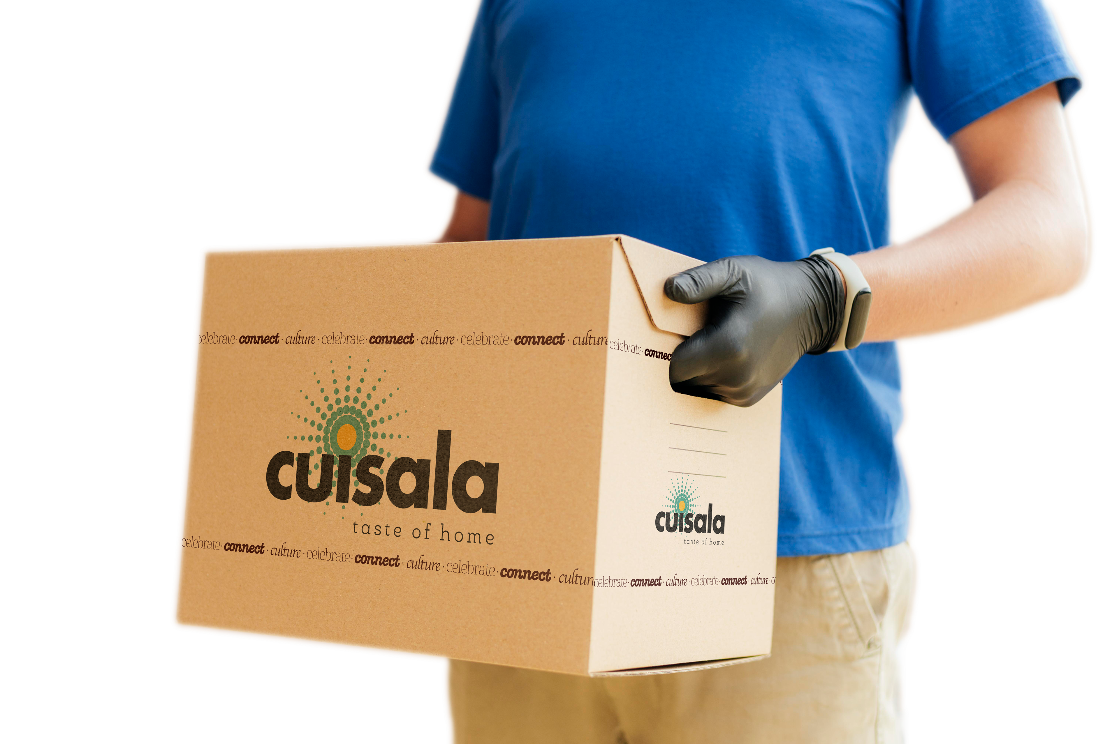
Looking at Cuisala's future as a specialty-food delivery service, I mocked up boxes,
and trucks...
and stickers to sell on their website...
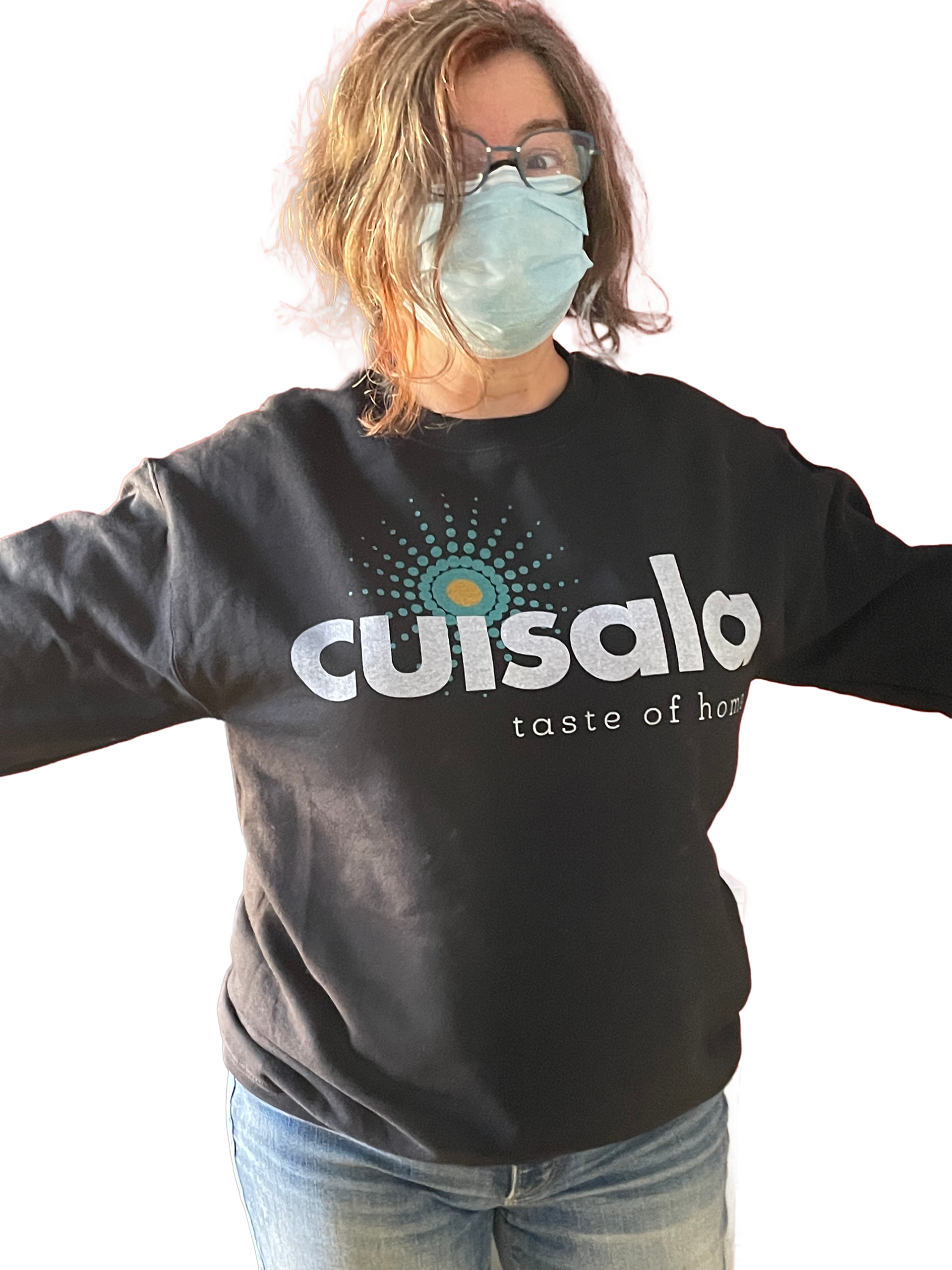
and sweatshirts. The sweatshirts were produced and sold to customers.