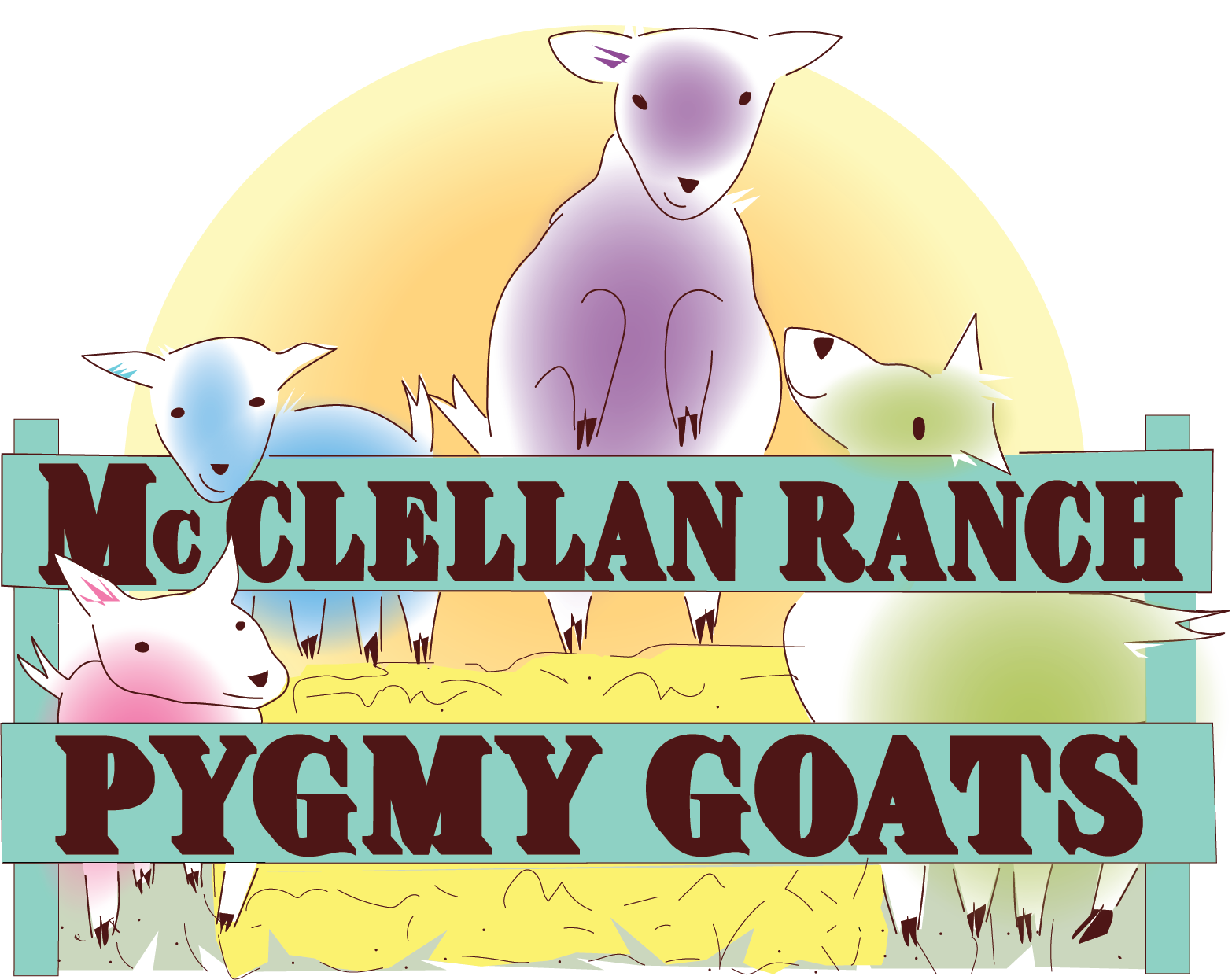
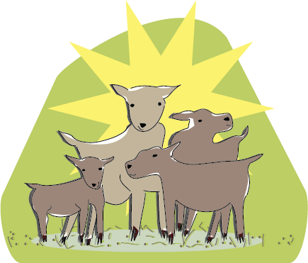
I used cartoon drawings for an ageless appeal and to establish an emotional connection with prospective members.
Spot illustrations are used as print and digital assets to help make the club information more organized.
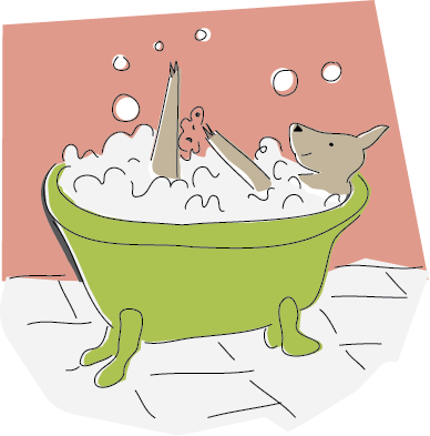

the squeaky clean club

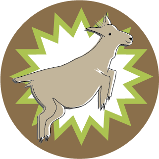
kidding around

meet me in my herd
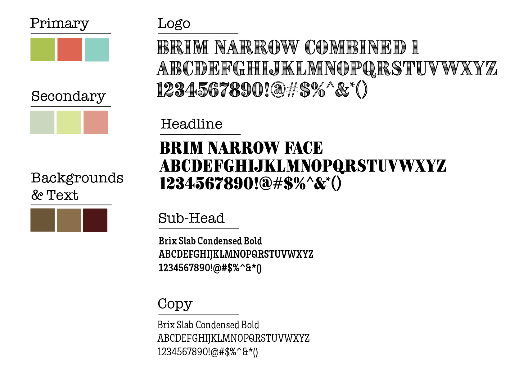
Two main typefaces were chosen to evoke "barn life" and to provide contrast in the typography. The color palette was chosen to stand out from the parent organization (4 H) which uses a strong kelly green in its logo and to provide a coordinating background for the many photos of goats and red barns that will be shown on the website and social media.
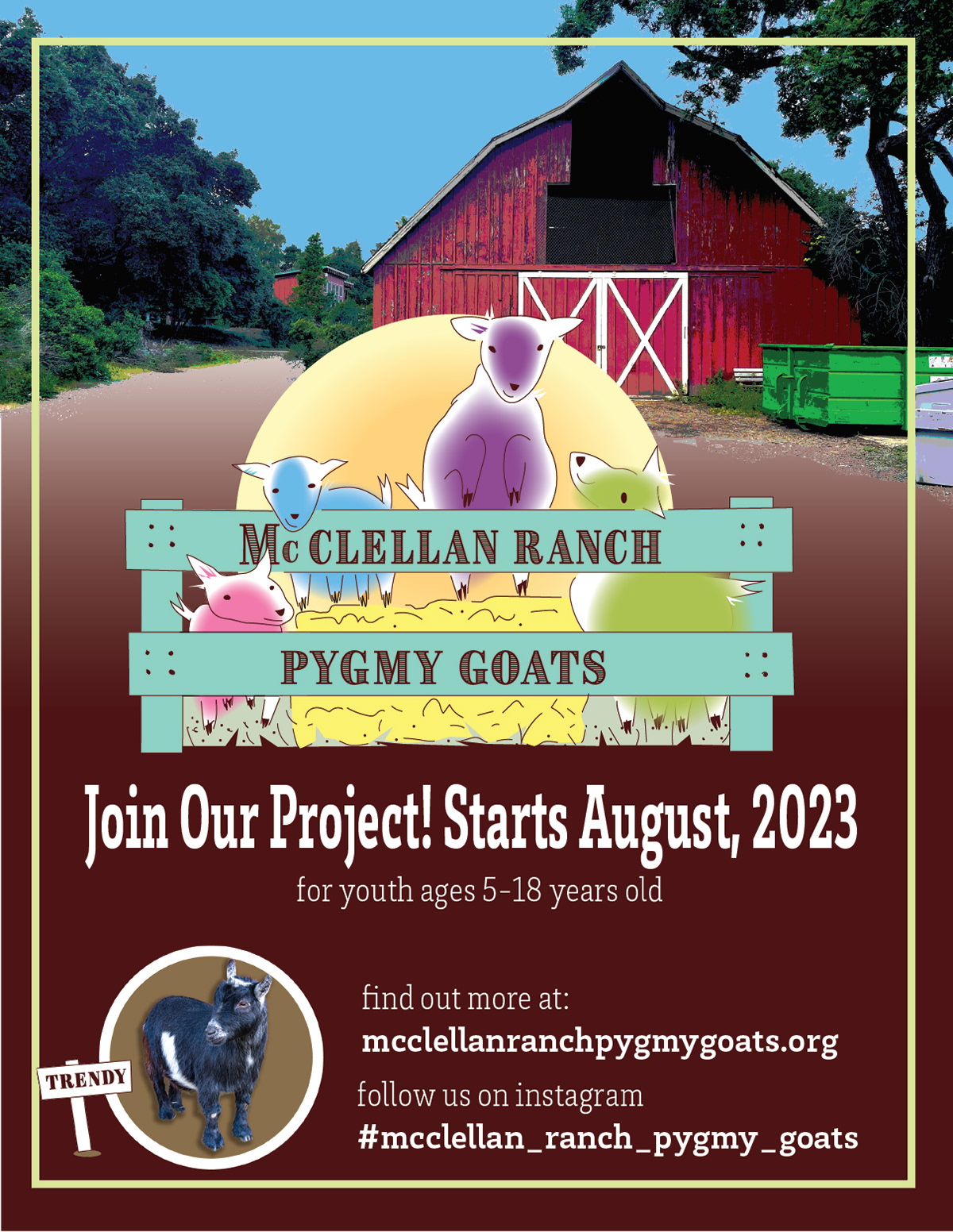
On-going flyers and social media posts will be developed using the new brand identity.
I used a website builder to quickly create a website.